The Psychology of Color in Abstract Expressionism
Abstract Expressionism, a pivotal movement in mid-20th century art, revolutionized the way we perceive art. Unlike previous movements that focused on depicting the external world, Abstract Expressionism aimed to express inner emotions and psychological states. Central to this endeavor was the use of color, not merely as a descriptive tool, but as a primary means of communication. This article delves into how Abstract Expressionist artists used color to convey profound emotional experiences, and how our brains respond to these vibrant and often non-representational forms.
The Neuroscience of Color Perception
Our response to color is deeply rooted in both biology and psychology. When we view a work of art, light reflects off the surface and enters our eyes, stimulating specialized cells in the retina. This information is then relayed to the brain, where it’s processed in various regions, including those associated with emotion and memory. Research in neuroesthetics, as discussed in What does the brain tell us about abstract art?, shows that abstract art engages areas across the brain that are also activated by other forms of art. This diffuse brain activity indicates that abstract art, including Abstract Expressionism, operates on a fundamental level of visual processing, utilizing basic elements such as color, line, and form to stimulate perception. Unlike representational art, which activates specific brain regions associated with object recognition, abstract art frees the brain from the constraints of reality, allowing for deeper engagement with emotional and cognitive processes.
Styles Within Abstract Expressionism
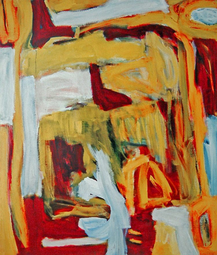
Abstract Expressionism encompasses a range of styles, each with its unique approach to color. Two prominent styles are Gestural Abstraction and Color Field painting. While diverse, these styles share a commitment to expressing inner states, deeply intertwined with the psychological impact of color.
Color Field Painting
Artists like Mark Rothko, Barnett Newman, and Clyfford Still exemplified Color Field painting. They moved beyond traditional composition, creating expansive “fields of color” that dominate the canvas, as seen on Tate. Rothko’s works, for instance, often feature large, rectangular blocks of color with soft, blurred edges. Consider his “Orange, Red, Yellow” (1961). The vibrant hues and subtle gradations within each color field are designed to evoke a range of emotions, from tranquility to intense arousal. The sheer scale of these paintings envelops the viewer, creating an immersive experience. Newman’s “Who’s Afraid of Red, Yellow and Blue IV” (1969/70), directly engages with the psychological impact of color as explored in Colour aesthetics in art and design.
Gestural Abstraction
This style, associated with artists like Jackson Pollock and Willem de Kooning, incorporates color as an emotional element, often alongside dynamic mark-making. Pollock’s “drip paintings” are not solely about spontaneous gesture; his moods influenced the color choices and application, a connection explored in depth in What Is Abstract Expressionism?. While seemingly chaotic, the selection and placement of colors were intrinsically linked to his emotional state. De Kooning’s vigorous brushstrokes and bold color palettes similarly reflect emotional intensity, with color contributing to the overall sense of dynamism.
The Emotional Code of Color
Different colors evoke distinct emotional responses, a principle central to Abstract Expressionism. Studies, such as those discussed in Unlocking the Emotional Code of Abstract Art, demonstrate a systematic use of color to express specific emotions. For example, red and black are often associated with anger, while yellow, orange, and pink are linked to joy and wonder. Abstract Expressionists, either consciously or intuitively, used these associations to create works that speak directly to the viewer’s emotional core. The use of bold reds might reflect intense emotional turmoil, while serene blues might inspire calmness, as detailed in Color and emotions.
Universal and Cultural Dimensions of Color
While some emotional responses to color appear to be universal, cultural contexts also play a significant role. Certain color perceptions seem biologically and psychologically grounded, shared by people regardless of cultural background. For instance, blue is often associated with calm and stability, possibly linked to the calming effect of the sky and sea. However, different cultures ascribe unique symbolic meanings to colors. In Western cultures, red can represent both love and danger, while in some Eastern cultures, it symbolizes luck and prosperity. Abstract Expressionists, while often aiming for universal emotional expression, were inevitably influenced by their own cultural backgrounds, and viewers’ interpretations are likewise shaped by their individual and cultural experiences, as highlighted in Universal and cultural power of colour in abstract art.
The Legacy of Color in Abstract Expressionism
Abstract Expressionism’s exploration of color has had a lasting impact on art. By prioritizing color as a primary means of emotional expression, these artists expanded the possibilities of painting. The movement demonstrated that art could communicate profound human experiences without relying on representational forms. This legacy continues to inspire artists today, reminding us that color is not just a visual element, but a powerful language capable of touching the deepest parts of our being. The understanding of color theory continues to be relevant to contemporary artists, as explored in UK Abstract Artist.